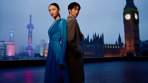
In recent years, the muted, understated palette of Giorgio Morandi has seeped into every corner of visual culture—interior design, fashion, branding, and even digital interfaces. What began as an appreciation for subtlety has morphed into a pervasive aesthetic regime, one that dictates taste under the guise of sophistication. The "Morandi tone," with its chalky pinks, dusty blues, and washed-out beiges, is now the unofficial uniform of contemporary minimalism. But as this trend hardens into dogma, a quiet rebellion brews: when does restraint become repression?
The appeal of low saturation is undeniable. It whispers rather than shouts, offering a visual respite in an overstimulated world. Morandi’s own still-life paintings—reduced to quiet harmonies of bottles and bowls—exude a timeless serenity. Designers adopted this language for its ability to convey elegance without excess, a reaction against the garishness of earlier decades. Yet as the trend proliferated, something unexpected happened. The very neutrality meant to liberate aesthetics began to enforce its own constraints.
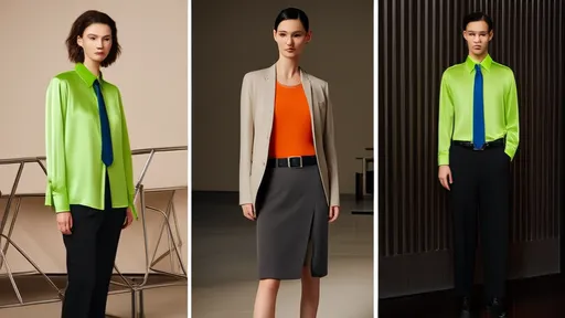
Walk into any boutique hotel or scroll through a lifestyle brand’s Instagram feed, and the sameness is jarring. The once-innovative palette now feels formulaic, a safety net for creativity. Critics argue that the Morandi trend has birthed a paradox: a color scheme intended to be non-imposing now dominates so thoroughly that it stifles alternatives. Bright hues are dismissed as juvenile; high contrast is deemed aggressive. In this new hierarchy, "quiet luxury" isn’t just a style—it’s a mandate.
The tyranny of low saturation reveals deeper cultural anxieties. In an era of climate crises and social upheaval, pale tones offer the illusion of control and calm. They function as a visual sedative, smoothing over chaos with their gentle gradients. But this preference isn’t purely organic—it’s engineered. Algorithms favor cohesive aesthetics, rewarding accounts and brands that adhere to the muted gospel. The result? A feedback loop where deviation risks invisibility.
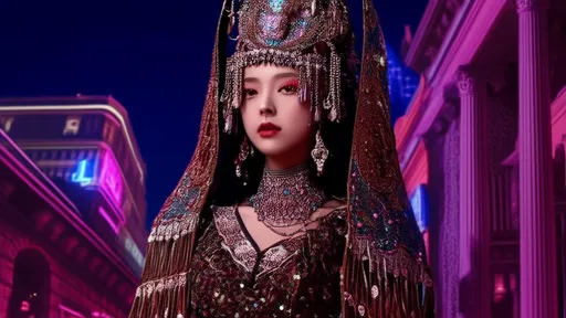
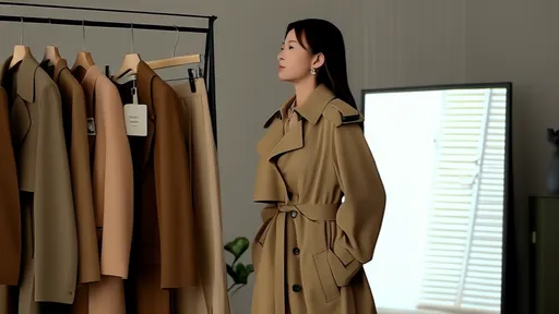
Fashion tells a similar story. Runways once celebrated bold statements, but now, beige-on-beige ensembles dominate luxury collections. The message is clear: loud colors are gauche, a faux pas for the discerning elite. Yet historians note that color restraint has long been a tool of class distinction. In the 18th century, pastels signaled wealth (only the rich could keep delicate fabrics clean). Today, the Morandi palette performs the same role—its subtlety implying you have nothing to prove.
Interior design exposes another layer of the trap. Neutral walls and furniture promise versatility, but they also demand perfection. A single misplaced object disrupts the fragile harmony, turning homes into high-maintenance dioramas. Psychologists observe that these spaces, while photogenic, often fail their inhabitants emotionally. Color deprivation can dampen mood and creativity, a fact the trend conveniently ignores.
The backlash is emerging in unexpected places. Younger generations, raised on Instagram’s beige utopia, are rediscovering the joy of saturation. Maximalism is making a comeback, not as rebellion but as relief. Designers like Adam Nathaniel Furman and brands like Collina Strada embrace clashing hues, rejecting the notion that sophistication requires dilution. Even Morandi’s legacy is being reexamined—his quiet tones were radical in their time, a defiance of fascist Italy’s bombastic aesthetics.
Perhaps the greatest irony is this: the Morandi trend, born from a desire to escape visual noise, has become its own kind of noise. When every café, outfit, and advertisement blends into the same hazy backdrop, the effect is numbing rather than nourishing. True aesthetic freedom doesn’t lie in any single palette—it lies in the right to choose, loudly or softly, without apology.
As the pendulum swings, one thing is clear: color is never just color. It’s a battleground for taste, class, and power. The Morandi trap reminds us that no aesthetic, no matter how gentle, remains innocent when it monopolizes the conversation. The next chapter of visual culture won’t be written in whispers—it’s time to turn up the volume.
By /Aug 13, 2025
By /Aug 13, 2025
By /Aug 13, 2025

By /Aug 13, 2025
By /Aug 13, 2025

By /Aug 13, 2025

By /Aug 13, 2025
By /Aug 13, 2025
By /Aug 13, 2025

By /Aug 13, 2025

By /Aug 13, 2025

By /Aug 13, 2025
By /Aug 13, 2025
By /Aug 13, 2025
By /Aug 13, 2025
By /Aug 13, 2025
By /Aug 13, 2025

By /Aug 13, 2025

By /Aug 13, 2025
By /Aug 13, 2025